
Power BI 'new look' updated, close to becoming default experience
By Hamza Jawad @@HamzaJawad98 · Sep 17, 2020
By Hamza Jawad @@HamzaJawad98 · Sep 17, 2020
[SHOWTOGROUPS=4,20,22]
Last year, Microsoft Для просмотра ссылки Войдиили Зарегистрируйся in the form of a public preview. Some of the changes introduced as part of that were brought to Power BI workspaces earlier this year. Then, in August, the mobile version of the service received an updated navigation experience, among other enhancements.
Today, a Для просмотра ссылки Войдиили Зарегистрируйся by Microsoft for Power BI, bringing it more in line with the more modern look the data visualization service is going for. A recap of some of the changes recently introduced has also been posted.
The previously brought about changes have been condensed into the following list:
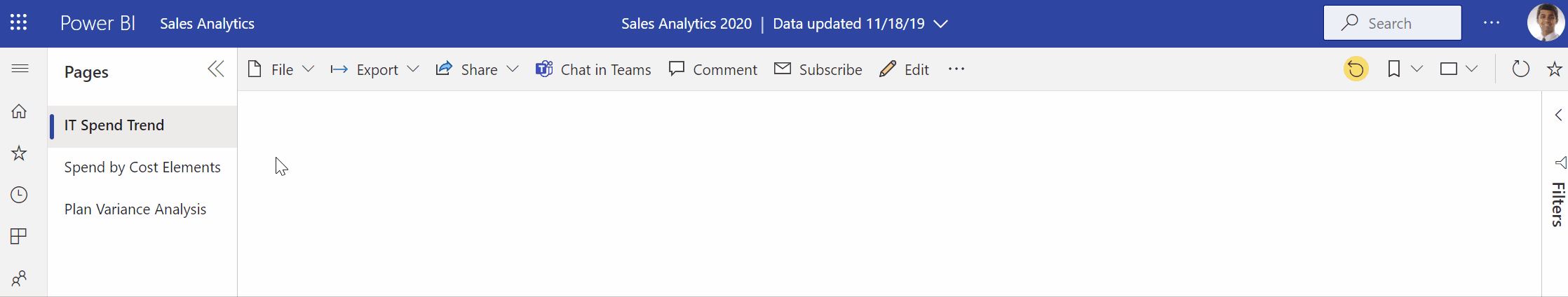
As to the newly introduced changes, for starters, a more simplified action bar as shown above for both reports and dashboards is going to help perform commonly used actions with ease. The page navigation settings can now also be configured by report authors, enabling report pages to be located either on the left side in a pane or at the bottom of a report in the form of tabs.
Moving on, some other navigation-based updates have been introduced as well. Clicking the global navigation hamburger icon on the top-left side will minimize the corresponding pane, showcasing simply the navigation icons and hiding their names. Meanwhile, clicking the pages icon arrows while utilizing left side navigation within reports - as opposed to bottom tab navigation - will collapse the experience completely.
Users who have the new look option in the header enabled will be able to receive the aforementioned enhancements over the next week. Nearing the end of the month, tenant admins will be able to switch all users to the modern look through a new setting, and remove the old and new look toggle. And then, at the end of October, the new look will become generally available, moving all tenants and users to it as the default setting.
[/SHOWTOGROUPS]
Last year, Microsoft Для просмотра ссылки Войди
Today, a Для просмотра ссылки Войди
The previously brought about changes have been condensed into the following list:
- New workspaces: Easier to scan, find what you need, get data, search, take quick actions, and more. Read all about workspaces updates here.
- Updated personal bookmarks: Previously, selecting a personal bookmark would update the bread crumb in the top bar with the name of the bookmark. Moving forward, the bookmark name will be updated inline within the context of your report action bar.
- View report details: See details such as last refresh date and contact information quickly, right in the top banner.
- Vertical list of pages: Report page names are now in a list in a vertical pane. They’re prominent, hard to miss, and similar to navigation in Word and PowerPoint.
- Improved filter experience: Updates such as viewing applied filters and the new filters pane are available by default with the ‘new look’.
- Dashboard experience: Dashboards also have a simplified action bar, just like reports and apps, for a consistent experience, while retaining the functional differences.
As to the newly introduced changes, for starters, a more simplified action bar as shown above for both reports and dashboards is going to help perform commonly used actions with ease. The page navigation settings can now also be configured by report authors, enabling report pages to be located either on the left side in a pane or at the bottom of a report in the form of tabs.
Moving on, some other navigation-based updates have been introduced as well. Clicking the global navigation hamburger icon on the top-left side will minimize the corresponding pane, showcasing simply the navigation icons and hiding their names. Meanwhile, clicking the pages icon arrows while utilizing left side navigation within reports - as opposed to bottom tab navigation - will collapse the experience completely.
Users who have the new look option in the header enabled will be able to receive the aforementioned enhancements over the next week. Nearing the end of the month, tenant admins will be able to switch all users to the modern look through a new setting, and remove the old and new look toggle. And then, at the end of October, the new look will become generally available, moving all tenants and users to it as the default setting.
[/SHOWTOGROUPS]