Slack overhauls Android app with new UI and navigation, available to beta users
By Abhay Venkatesh @abhay_venkat4 · May 5, 2020
By Abhay Venkatesh @abhay_venkat4 · May 5, 2020
[SHOWTOGROUPS=4,20]
Для просмотра ссылки Войдиили Зарегистрируйся
Slack Для просмотра ссылки Войдиили Зарегистрируйся with a new navigation design, improved organization of channels, and more. The update was a welcome addition as it increased the ease of use, whilst also improving aesthetics. Now, the Android version of the service is receiving a major overhaul that ditches the hamburger menu-heavy design for a tabbed interface.
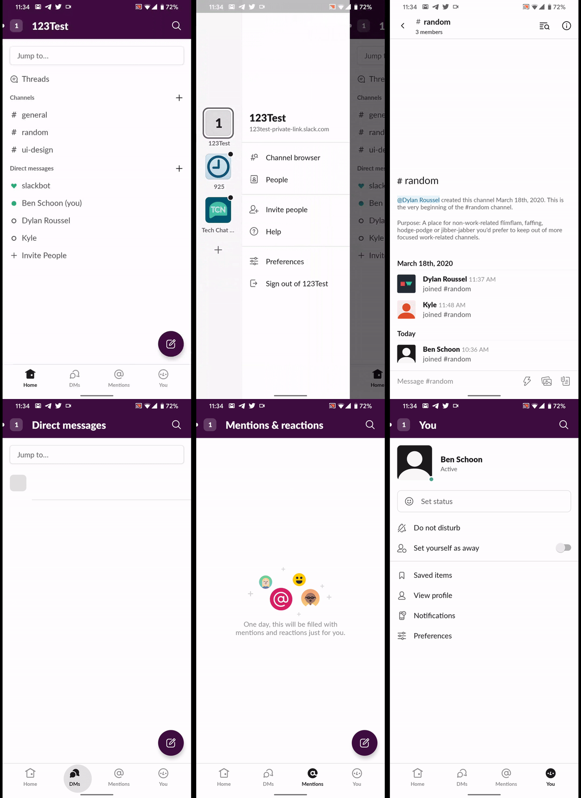
The earlier design of the app housed almost all the functions and navigation in the hamburger menu, making it slightly less intuitive for moving between chats and other options. The new design now brings a navigation bar at the bottom that houses four tabs – Home, DMs, Mentions, and You. The Home bar provides the list of channels and direct messages that the user has, along with options for inviting people, or the usual options for a new DM or a Channel.
The DMs and Mentions tabs, as the name suggests, list the direct messages and mentions that a user may have separately. An interesting addition is the introduction of left and right-swipe actions. Swiping right on the app now brings up a panel that lets users switch teams, access settings, and sign out. Swiping left jumps to the most recent channel or DM that was opened, for quick access. The swipe actions are a nifty addition.
The new design is a complete departure from what was on offer earlier, and breathes new life into the app. However, the new interface might take a little getting used to. Users running the beta version of the app should receive this update. It will not be surprising if the overhaul begins rolling out to all users sooner rather than later.
Source: Для просмотра ссылки Войдиили Зарегистрируйся
[/SHOWTOGROUPS]
Для просмотра ссылки Войди
Slack Для просмотра ссылки Войди
The earlier design of the app housed almost all the functions and navigation in the hamburger menu, making it slightly less intuitive for moving between chats and other options. The new design now brings a navigation bar at the bottom that houses four tabs – Home, DMs, Mentions, and You. The Home bar provides the list of channels and direct messages that the user has, along with options for inviting people, or the usual options for a new DM or a Channel.
| Для просмотра ссылки Войди |

| Для просмотра ссылки Войди |
The DMs and Mentions tabs, as the name suggests, list the direct messages and mentions that a user may have separately. An interesting addition is the introduction of left and right-swipe actions. Swiping right on the app now brings up a panel that lets users switch teams, access settings, and sign out. Swiping left jumps to the most recent channel or DM that was opened, for quick access. The swipe actions are a nifty addition.
The new design is a complete departure from what was on offer earlier, and breathes new life into the app. However, the new interface might take a little getting used to. Users running the beta version of the app should receive this update. It will not be surprising if the overhaul begins rolling out to all users sooner rather than later.
Source: Для просмотра ссылки Войди
[/SHOWTOGROUPS]
